

Don’t know how to create a clustered column chart in Excel?
You’re not alone.
You’ve got data sitting in rows and columns… but it’s hard to compare anything.
“Which category is higher?”
“Which one is growing?”
Yeah, numbers alone don’t help much.
A clustered column chart fixes that by turning your data into clear, side-by-side bars.
Don’t worry, I’ve broken it down into simple steps for you.
Key Takeaways
- Clustered column charts help you compare multiple values quickly
- You only need Insert tab + your data to create one
- 2D charts are better for clarity
- Pivot charts are useful when working with large or structured datasets
- Adding a chart title, labels, and colors makes your chart easier to understand instantly
What Is a Clustered Column Chart in Excel
A clustered column chart shows multiple data series using vertical bars grouped together.
Each group = one category
Each bar = one value inside that category
Example: You can compare sales across regions for each quarter easily.
Instead of reading numbers, you can see the difference instantly.
Where Is the Clustered Column Chart in Excel
You’ll find it here:
Insert → Column Chart → Clustered Column
That’s the main place you need.
📖 You May Also Like This “MS Excel” Article: How to Use XLOOKUP in Excel (Step-by-Step Guide)
How to Create a Clustered Column Chart in Excel
Steps:
- Select your data
- Go to the Insert tab
- Choose a clustered column chart
- Adjust your chart
- Customize your chart
Step 1: Select your data
Click and drag to select the data you want to visualize.
Step 2: Go to the Insert tab
At the top menu:
- Click Insert
- Find the Column Chart icon
Step 3: Choose Clustered Column Chart
Click the chart from the dropdown and select:
Clustered Column (2D)
Excel will instantly create the chart for you.
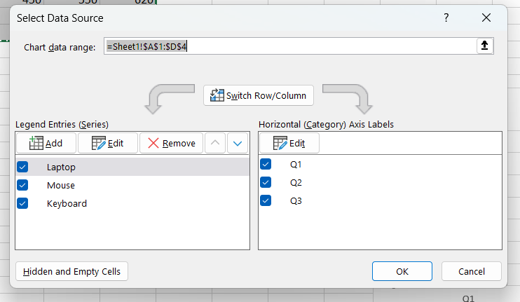
Step 4: Adjust your chart
If something looks off:
1. Click the chart
2. Go to Chart Design → Select Data
Fix rows/columns if needed.
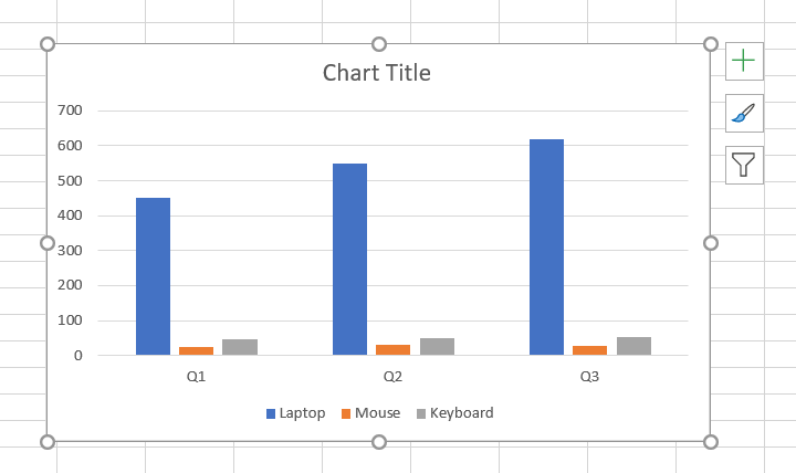
Step 5: Customize your chart
Make it easier to read:
1. Open the Chart Elements (+ icon) on the right side. From the options, enable the “Chart Title & Data Labels” bar.
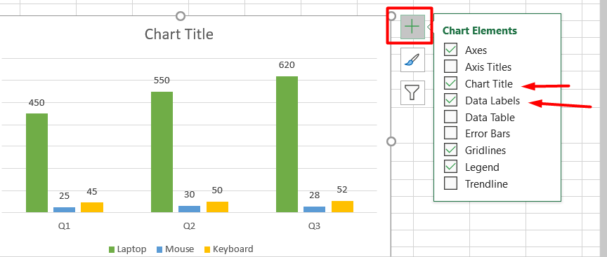
2. Click on the chart to select it, then open the Chart Styles (paintbrush icon) on the right side. Go to the Color tab and choose a color palette that fits your data
Now your chart is clear and useful.
How to Insert a Clustered Column Pivot Chart in Excel
If your dataset is large, use a Pivot Chart.
Steps:
- Select your full dataset
- Go to the Insert tab → Click PivotTable
- Choose New Worksheet → Click OK
- Drag fields (Rows & Values) in the PivotTable panel
- Click Insert → PivotChart
- Choose Clustered Column → Click OK
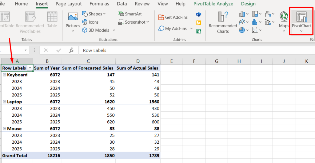
1. Select your full dataset, then go to the Insert tab and click on PivotTable
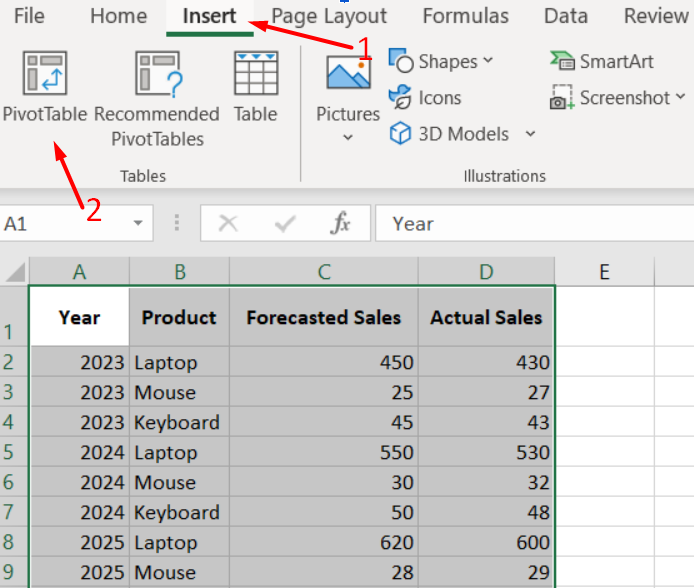
2. In the pop-up window, keep your table selected and choose New Worksheet, then click OK.
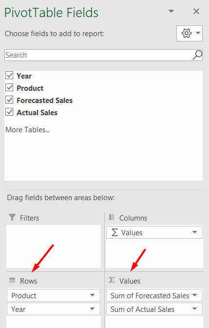
3. On the right panel:
- Drag Product and Year into Rows
- Drag Forecasted Sales and Actual Sales into Values
This organizes your data for charting.
4. Click anywhere inside your PivotTable, then go to the Insert tab at the top menu and click on PivotChart to start creating your chart.
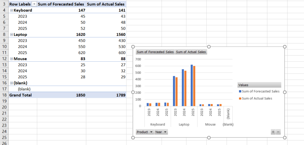
5. Choose Clustered Column Chart. In the chart window, select “Clustered Column” and then click OK.
6. Your chart is created. Excel will generate a clustered column pivot chart based on your data. You can now move, resize, or customize it.
📖 You May Also Like This “MS Excel” Article: How to Convert a Word Document to Excel
How to Insert a 2D Clustered Column Chart in Excel
This is the most common type.
Steps:
- Insert tab
- Column chart
- Select 2D Clustered Column
Use it for:
- Clean comparisons
- Easy readability
How to Insert a 3D Clustered Column Chart in Excel
You can also use a 3D version. Go to the Insert tab, click on the Column Chart icon, then open the dropdown and choose 3-D Clustered Column if you want a 3D version of your chart.
Looks nice, but can be harder to read.
Final Thoughts
You don’t need complex tools to visualize your data.
Just:
- Select your data
- Insert chart
- Adjust it
Once you start using charts, your data becomes much easier to understand.
That’s it