
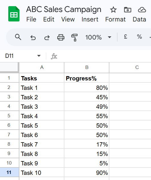
You’re tracking tasks in Google Sheets… but all you see are numbers.
Hard to tell what’s done and what’s stuck.
Good news: you can turn those numbers into visual progress bars (data bars) in minutes.
No add-ons. No complex setup.
I’ll show you exactly how to create, insert, and customize a progress bar step by step.
Key takeaways
- You can create progress bars (data bars) in Google Sheets using a simple SPARKLINE formula.
- The formula instantly turns numbers into visual bars inside cells—no add-ons needed.
- Always use decimal values (0.5 = 50%) or the bars won’t display correctly.
- You can copy the formula down to generate bars for multiple rows in seconds.
- Colors can be customized or made dynamic based on progress levels.
- Combine AVERAGE + SPARKLINE to track overall progress in one clean bar.
- Adjusting column width, row height, and formatting makes bars easier to read.
- Once set up, you can reuse this method to track tasks, goals, or projects instantly.
What You’ll Create
Before we start, here’s what you’re building:
- Column A → Task names
- Column B → Progress (like 0.5 for 50%)
- Column C → Visual progress/data bars
Example:
- Task 1 → 0.75 → ███████░░
- Task 2 → 0.30 → ███░░░░░░
Steps to Make a Progress Bar in Google Sheets
Steps Overview:
- Enter your data
- Add the progress bar formula
- Copy it down
- Customize (optional)
Step 1: Enter Your Data
Start simple.
- Open a new Google Sheet
- Add task names in Column A
- Add progress values in Column B
Step 2: Add the Progress Bar Formula
Now we create the actual bar.
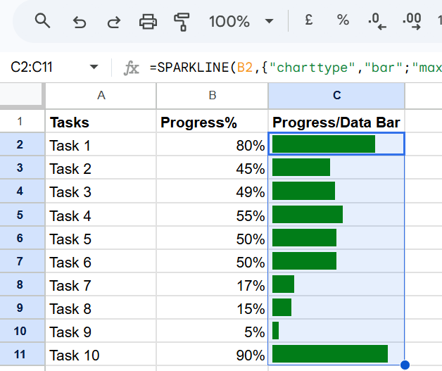
Click on cell C2 and paste this:
=SPARKLINE(B2,{“charttype”,”bar”;”max”,1;”min”,0;”color1″,”green”})
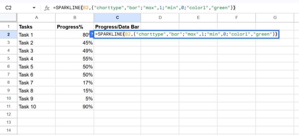
Press Enter.
You’ll see a bar appear instantly.
What this formula means (simple version):
- B2 → your progress value
- charttype “bar” → creates a bar
- max 1 → 100%
- color1 “green” → bar color
That’s it. You don’t need to overthink it.
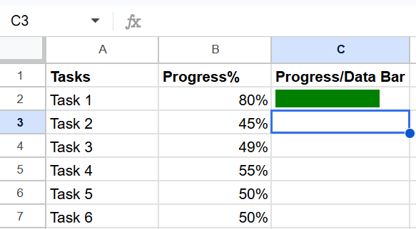
Step 3: Copy the Formula Down
Now apply it to all rows.
- Click on cell C2
- Drag the small blue square downward
Now every task has its own progress bar.
Step 4: Customize Your Progress Bars (Optional)
You can make your bars more useful.
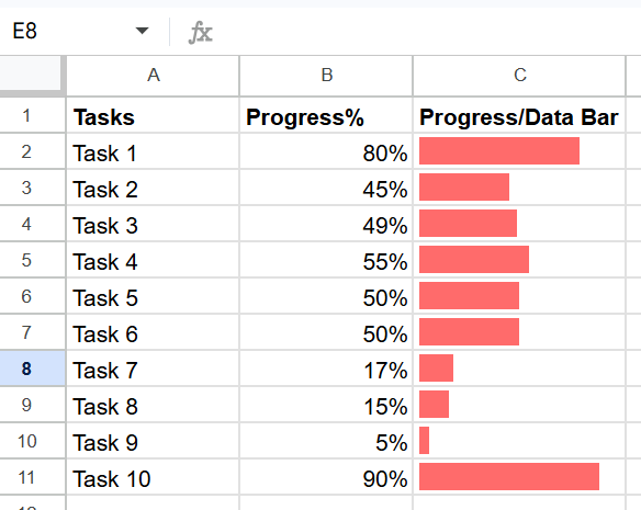
Change Color
Replace “green” with any color:
“red”
“blue”
“#FF6B6B”
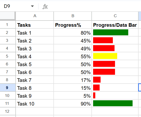
Add Smart Colors (Based on Progress)
You can change colors automatically.
Paste this:
=SPARKLINE(B2,{“charttype”,”bar”;”max”,1;”min”,0;”color1″,
IF(B2>0.7,”green”,IF(B2>0.5,”yellow”,”red”))})
Now:
- Above 70% → Green
- 50–70% → Yellow
- Below 50% → Red
📖 You May Also Like This “Google Sheet” Article: How to Change Currency in Google Sheets?
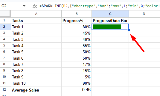
How to Add an Overall Progress Bar
Want to track total progress?
Step 1: Calculate the average
In a new cell (B12), paste the following formula:
=AVERAGE(B2:B11)
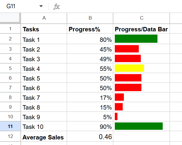
Step 2: Add a bar for it
=SPARKLINE(B12,{“charttype”,”bar”;”max”,1;”min”,0;”color1″,”blue”})
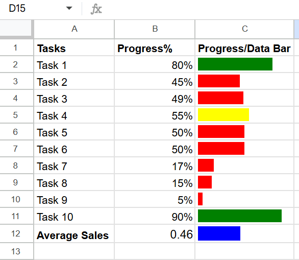
Now you can instantly see overall progress.
📖 You May Also Like This “Google Sheet” Article: How to Group Sheets (Tabs) in Google Sheets
How to Make Progress Bars Bigger and Clearer
If your bars look too small, fix this:
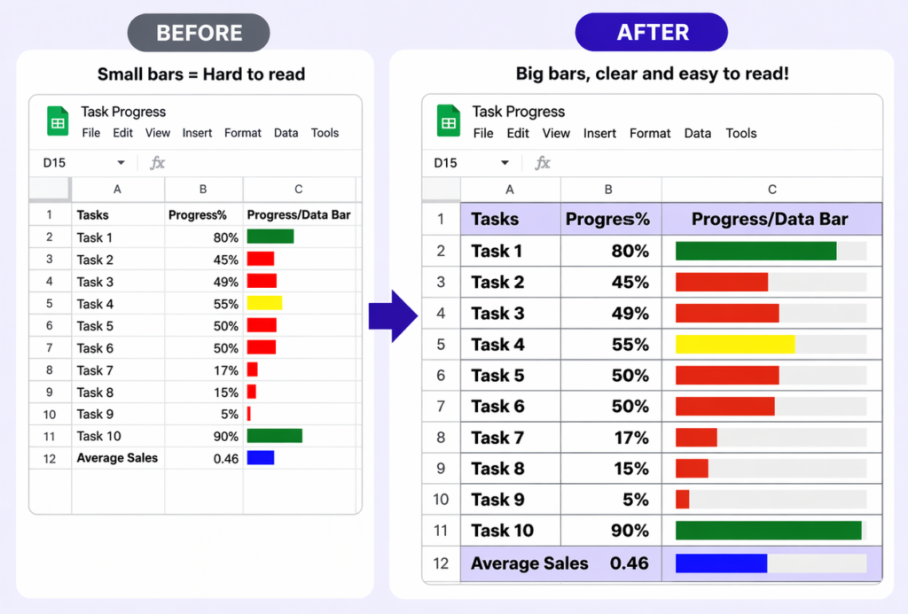
- Increase column width
- Increase row height
- Add borders
- Bold headers
Common Issues (And Quick Fixes)
Bars not showing?
- Check if values are decimals (not 50, use 0.5)
Bars look too small?
- Resize the column
Colors not working?
- Check formula brackets carefully
Formula breaking?
- Make sure quotes and commas are correct
When Should You Use Progress Bars?
Use them when you want quick visibility.
Examples:
- Task tracking
- Project updates
- Goal progress
- Sales tracking
Instead of reading numbers, you can see progress instantly.
Final Thoughts
Progress bars turn boring numbers into something you can understand in seconds.
Once you set this up, you can reuse it in any sheet.
No extra tools needed.